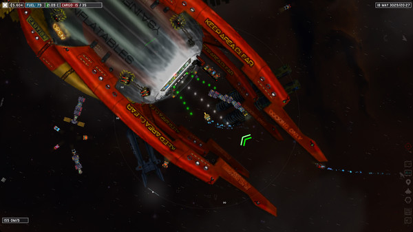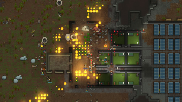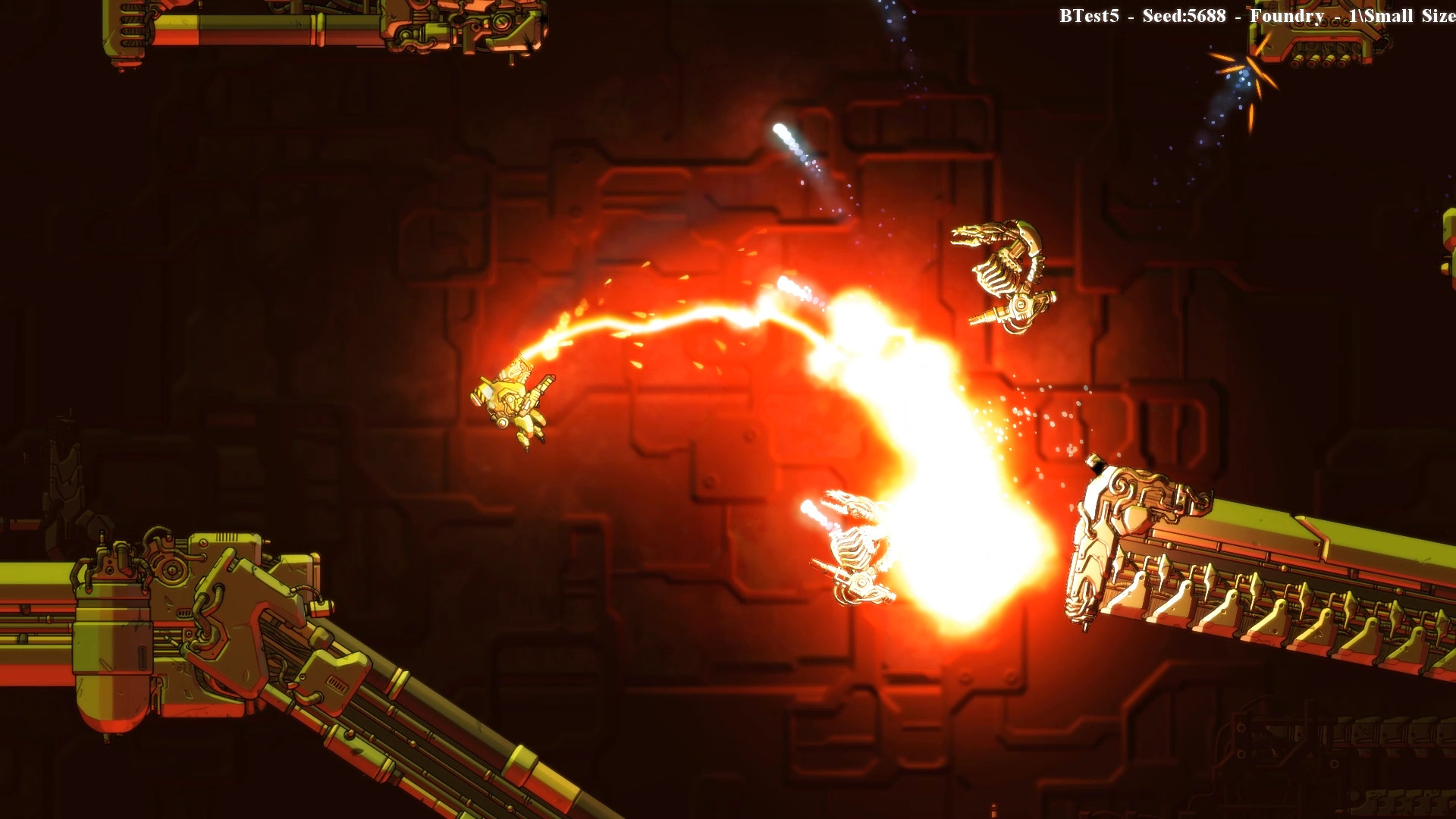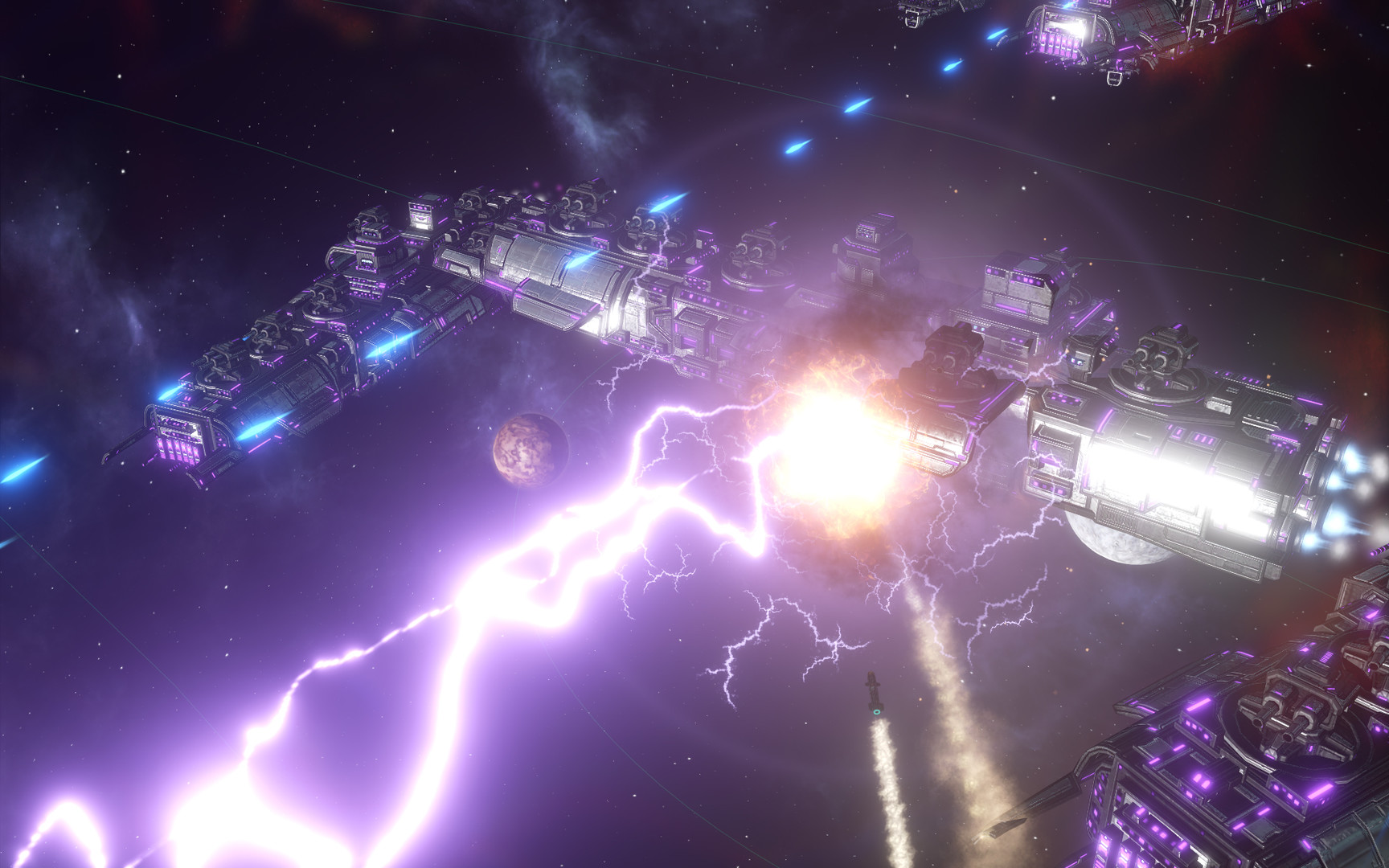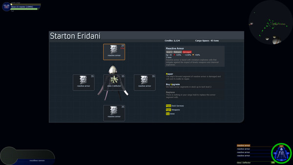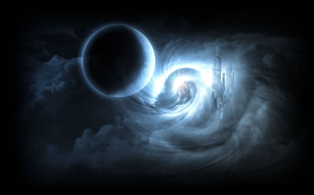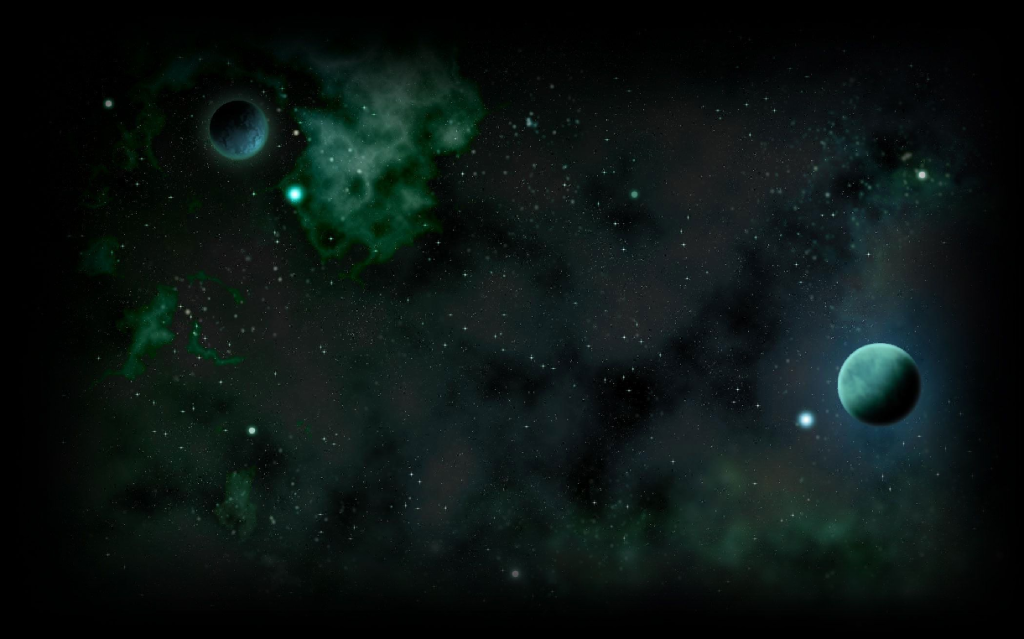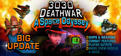
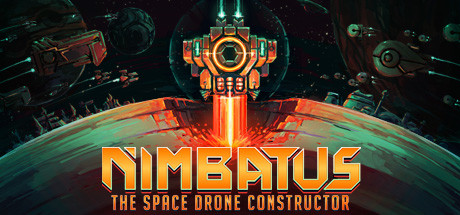
I had to look at the Kronosaur twitter recently and these were some of the games that were promoted there:
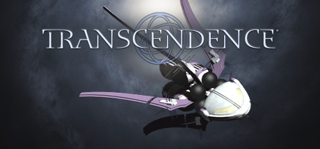
Compare that to:
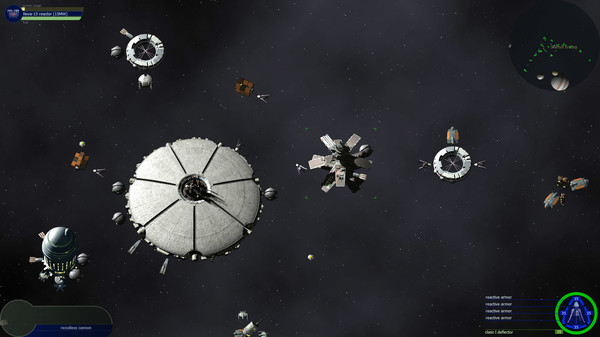
#1: Transcendence has a very grey, very muted color scheme. Not great for advertisement.
#2: Even gameplay screenshots are dull:
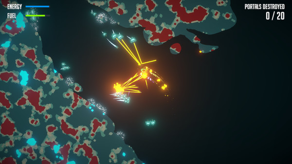
What can we do about this?
The Transcendence Color Palette VS Other Games
-
- Fleet Admiral
- Posts: 2876
- Joined: Thu Feb 03, 2011 5:21 am
- Location: Hmm... I'm confused. Anybody have a starmap to the Core?
Tutorial List on the Wiki and Installing Mods
Get on Discord for mod help and general chat
Der Tod ist der zeitlose Frieden und das leben ist der Krieg
Wir müssen wissen — wir werden wissen!
I don't want any sort of copyright on my Transcendence mods. Feel free to take/modify whatever you want.
Get on Discord for mod help and general chat
Der Tod ist der zeitlose Frieden und das leben ist der Krieg
Wir müssen wissen — wir werden wissen!
I don't want any sort of copyright on my Transcendence mods. Feel free to take/modify whatever you want.
-
- Fleet Admiral
- Posts: 2876
- Joined: Thu Feb 03, 2011 5:21 am
- Location: Hmm... I'm confused. Anybody have a starmap to the Core?
suggestion from StealthX on Discord:
Code: Select all
energy weapons don't act as light sources right?
Tutorial List on the Wiki and Installing Mods
Get on Discord for mod help and general chat
Der Tod ist der zeitlose Frieden und das leben ist der Krieg
Wir müssen wissen — wir werden wissen!
I don't want any sort of copyright on my Transcendence mods. Feel free to take/modify whatever you want.
Get on Discord for mod help and general chat
Der Tod ist der zeitlose Frieden und das leben ist der Krieg
Wir müssen wissen — wir werden wissen!
I don't want any sort of copyright on my Transcendence mods. Feel free to take/modify whatever you want.
Dude. Visual style is a thing. There's definitely room to improve stuff (weapon graphics in particular have been overly homogenised), but there is no point in throwing out a bunch of games with vivid palettes and saying "let's look like this". We aren't those games. I might as well just put some screenshots of dwarf fortress or Crysis or whatever.
Transcendence is not an unpretty game. The UI and stuff could do with upgrades. Serious upgrades. And as part of that, colour can and should be reviewed. But the colour palette of the game itself is mostly fine. I for one, as someone who has trouble with bright light and too much vivid colour contrast, rather like it being somewhat subdued.
Mischievous local moderator. She/Her pronouns.
- AssumedPseudonym
- Fleet Officer
- Posts: 1193
- Joined: Thu Aug 29, 2013 5:18 am
- Location: On the other side of the screen.
I’m with Shrike on this one. Of the gameplay screenshots, the first words that comes to mind for me for that topmost one are “garish” or “tacky.” I like the quieter visual style of Transcendence, enough so that I changed several of my own ships and factions which, yes, look nothing like George’s style, and I’ll even be at the front of the line to say so to have more subdued palettes. Maybe there could be a bit more variety in color, but I wouldn’t honestly go far with it at all.
Mod prefixes: 0xA010 (registered) and 0xDCC8 (miscellaneous)
My mods on Xelerus: Click here!
Of all the things I’ve lost in life, I miss my mind the least. (I’m having a lot more fun without it!)
-
- Developer
- Posts: 2997
- Joined: Thu Jul 24, 2003 9:53 pm
- Contact:
In my opinion, the issue isn't the color palette but rather that screenshots need to be both distinctive and enticing. I think we do need to improve this. I've got a few rough ideas about how to do this:
1. More contrast: I personally like the muted colors of the game. It's a grittier and more realistic look and differentiates it from the cartoony style used by some other games. And you don't need lots of color to create beautiful art--just as Ansel Adams. But if you tone down colors, you need to increase the contrast--otherwise a screenshot looks boring and washed-out. I like the idea of lighting effects, but I don't know how to do it in the engine yet. But some kind of contrast boost either at the engine level (bloom effects, perhaps) or in the artwork would help.
2. More environments: Most screenshots show the player fighting ships next to a planet or a station. Sometimes the player is in an asteroid field or a nebula. But that's it. We need a greater variety of environments: more nebula types, more asteroid types, more megastructures, etc. In Part II I hope that some of the galactic creatures will form interesting ecosystems and environments.
3. More dock screen images: At minimum we could show the existing station models in more detail and different perspective. But eventually I'd like to have artwork for station interiors and even characters.
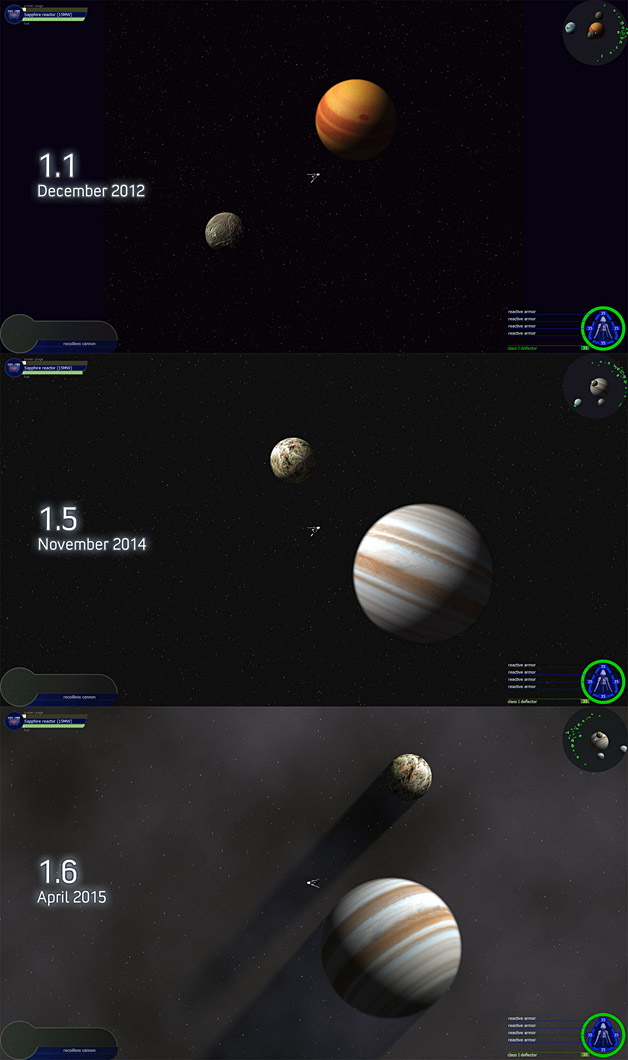
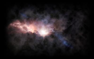
None of this will happen overnight, but every release improves things. Just look at some of the earlier screenshots:
It would be nice if energy weapon effects could (be able to) glow more. If I build a chain lightning weapon, I would like for it make things glow.
If could draw better than I do now, I would consider portrait or face mugs in dockscreens. If conversing with an NPC, you see the portrait of that person, maybe tough spaceman in a helmet, maybe anime-style young nurse with pink hair (and big eyes and a smile), maybe haggard old space admiral in military uniform, maybe blonde dude with big muscles and chomping on a cigar. Anything that makes the player feel like he is talking to someone instead of always seeing your hero ship image or a burnt-out station.
But graphics is not the worst part of Transcendence.
The thing most lacking is what you cannot see in the screenshots - sound! The same two sounds used for every primary weapon, especially when neither fit some weapons, seems... wrong.
Download and Play in 1.9 beta 1...
Drake Technologies (Alpha): More hardware for combat in parts 1 and 2!
Star Castle Arcade: Play a classic arcade game adventure, with or without more features (like powerups)!
Playership Drones: Buy or restore exotic ships to command!
Other playable mods from 1.8 and 1.7, waiting to be updated...
Godmode v3 (WIP): Dev/cheat tool compatible with D&O parts 1 or 2.
- Xephyr
- Militia Captain
- Posts: 857
- Joined: Fri Dec 14, 2007 1:52 am
- Location: Orion Arm, Milky Way
- Contact:
One thing that I had worked on in the past was a character portrait system - not just a static image of the character, but more of a visual novel system, where you could pass data into the dockscreen to set the character's mood/attitude and retrieve the appropriate image. With engine improvements we could also allow for scaling, translating, or animating portraits within the system as well.PM wrote: ↑Mon Sep 18, 2017 11:49 pmIf could draw better than I do now, I would consider portrait or face mugs in dockscreens. If conversing with an NPC, you see the portrait of that person, maybe tough spaceman in a helmet, maybe anime-style young nurse with pink hair (and big eyes and a smile), maybe haggard old space admiral in military uniform, maybe blonde dude with big muscles and chomping on a cigar. Anything that makes the player feel like he is talking to someone instead of always seeing your hero ship image or a burnt-out station.
But, as it turns out, the kind of effort to do that many character portraits (and never mind interior images) would definitely involve full time work for a while, even for how few characters there are in the game, if we go for a semi-photorealistic approach.
I do like the idea of it, and may eventually return to it, but I can't say whether or not its a good time investment.
Project Renegade (Beta) : "The Poor Man's Corporate Command!"
Real programmers count from 0. And sometimes I do, too.
Agreed. You could also use more screenshots showing combat. When particle beams are flying and fragmentation weapons are going off, it can get quite colorful (too much so, in some cases, I'd say).george moromisato wrote: ↑Mon Sep 18, 2017 11:14 pmIn my opinion, the issue isn't the color palette but rather that screenshots need to be both distinctive and enticing. I think we do need to improve this. I've got a few rough ideas about how to do this:
1. More contrast: I personally like the muted colors of the game. It's a grittier and more realistic look and differentiates it from the cartoony style used by some other games. ...
Full blown visual novel would be too much work for me. I would probably try small cartoony or anime-style portraits like in Phantasy Star 4 or any '90s fighting game character select.Xephyr wrote: ↑Tue Sep 19, 2017 12:06 amOne thing that I had worked on in the past was a character portrait system - not just a static image of the character, but more of a visual novel system, where you could pass data into the dockscreen to set the character's mood/attitude and retrieve the appropriate image. With engine improvements we could also allow for scaling, translating, or animating portraits within the system as well.
But, as it turns out, the kind of effort to do that many character portraits (and never mind interior images) would definitely involve full time work for a while, even for how few characters there are in the game, if we go for a semi-photorealistic approach.
I do like the idea of it, and may eventually return to it, but I can't say whether or not its a good time investment.
Download and Play in 1.9 beta 1...
Drake Technologies (Alpha): More hardware for combat in parts 1 and 2!
Star Castle Arcade: Play a classic arcade game adventure, with or without more features (like powerups)!
Playership Drones: Buy or restore exotic ships to command!
Other playable mods from 1.8 and 1.7, waiting to be updated...
Godmode v3 (WIP): Dev/cheat tool compatible with D&O parts 1 or 2.
Drake Technologies (Alpha): More hardware for combat in parts 1 and 2!
Star Castle Arcade: Play a classic arcade game adventure, with or without more features (like powerups)!
Playership Drones: Buy or restore exotic ships to command!
Other playable mods from 1.8 and 1.7, waiting to be updated...
Godmode v3 (WIP): Dev/cheat tool compatible with D&O parts 1 or 2.
-
- Fleet Admiral
- Posts: 2876
- Joined: Thu Feb 03, 2011 5:21 am
- Location: Hmm... I'm confused. Anybody have a starmap to the Core?
That's my point. Boring style = sucky game presentation = consumers: "why bother?" = we failed to entice the players into our game.Visual style is a thing.
An important thing to note is that we are NOT the audience for these images, so even if we defend it under "art style", it fails as a marketing tool.
I can't respond much right now because busy IRL, but look at the top space games on steam:
http://store.steampowered.com/tag/en/Sp ... TopSellers
This is a particular offender because we confess to how much whitespace (in this case, blackspace) that the game neglects to use
Tutorial List on the Wiki and Installing Mods
Get on Discord for mod help and general chat
Der Tod ist der zeitlose Frieden und das leben ist der Krieg
Wir müssen wissen — wir werden wissen!
I don't want any sort of copyright on my Transcendence mods. Feel free to take/modify whatever you want.
Get on Discord for mod help and general chat
Der Tod ist der zeitlose Frieden und das leben ist der Krieg
Wir müssen wissen — wir werden wissen!
I don't want any sort of copyright on my Transcendence mods. Feel free to take/modify whatever you want.
-
- Fleet Admiral
- Posts: 2876
- Joined: Thu Feb 03, 2011 5:21 am
- Location: Hmm... I'm confused. Anybody have a starmap to the Core?
Good examples taken from the picture thread:
Tutorial List on the Wiki and Installing Mods
Get on Discord for mod help and general chat
Der Tod ist der zeitlose Frieden und das leben ist der Krieg
Wir müssen wissen — wir werden wissen!
I don't want any sort of copyright on my Transcendence mods. Feel free to take/modify whatever you want.
Get on Discord for mod help and general chat
Der Tod ist der zeitlose Frieden und das leben ist der Krieg
Wir müssen wissen — wir werden wissen!
I don't want any sort of copyright on my Transcendence mods. Feel free to take/modify whatever you want.
-
- Commonwealth Pilot
- Posts: 80
- Joined: Sat Jul 26, 2014 5:26 pm
Expanding on what I said on discord, I'd suggest doing some slight visual improvements that would have what I feel a large effect.
Glow from explosions, energy weapons, thrusters, and the like. I'm not sure how they'd be supported by the engine, but I think having more than one light source would help improve the look of the game.
RPC, while you are more than entitled to continue doing so (as I do not believe it to be against our forum rules) I must ask you nicely: Your screenshots, particularly of other games are non-figuratively hurting my eyes and do not create any kind of a point as such. Please stop spamming them. They are different games. Different games by different authors in different genres with different playstyles. Their design decisions are made for different reasons. I could put a screenshot of my prettiest game of the last few years and it would accomplish the same purpose as your non-transcendence screenshots: absolutely nothing.
Now I'm going to stop being nice.
There is what some would describe as as a 'fine line' between critiquing the game and demanding a complete change because it does not suit your whims. Personally I'd say it's not so much "fine" as "really obvious". With respect, I feel you have drifted into the latter category. Transcendence has a visual style. It has had it, at the present count, for roughly 14 years. It has changed a lot, of course. Mostly for the better. A few things I don't like and it's clear there's a lot of things you don't like. It can be improved, certainly. But it is not going to change dramatically. If you want a bright and vivid adventure in the Transcendence universe, you are more than welcome to create your own work with its own distinct visual style. The engine is more than capable and I and many others would certainly welcome such a thing. But it is, frankly, an insult to a creative work and to the artist or artists behind it to demand a complete change simply because you don't like the style. If you don't like it, fine. If you think it's a bit 'boring' to have 3D models rendered into 2D sprites, that's fine. I disagree, as do many others but that's fine. If you prefer more vivid works? Fine. Say so, maybe folks will make some. Personally I find things a little bland at times, and my work on Shrike's Mines & Missiles, Elemental Shift and Shrike 'n' AssumedPseudonym's 'Superior' Sounds reflect this. This is a game that is massively expandable and alterable, even if it's not always easy to do so. We can change things for ourselves if we don't like them. That's marketable.
But saying "This is horrible" and spamming in garish screenshots of completely different games and demanding a full change in style is not going to help anything. It is not constructive. Frankly it's not even a suggestion. You're just throwing crap at the wall instead of pulling up specifics that can be easily fixed. Or indeed, fixed at all, or in need of fixing. 'Boring' is subjective. You are, to put it bluntly, not helping. Your own opinions of the games graphics are not the perspective of a new player. You've been here too long to be able to pull that card. I sure as hell can't pull it either. I try to think like a new player at times, and I keep track of questions I am asked by newbies...but I myself have been here for so long that I cannot, honestly, attempt to speak for a new player. Simply an old player who tries their best to design for them.
We have many things in this game that need improving to lower barriers to new players. Better tutorial systems, improved UI, simplified displays for armor and shield health, better communication of systems, more exciting early-game content (and more content in general), signposting, fixing of bugs and broken systems (eg. the Constellation)....there is a lot to do. It is our 'job' to point this out as players who want to grow the game. But screaming about how you don't like the graphics isn't a suggestion. It's a critique. A subjective one. Not, as I have stressed, a suggestion that is actionable. At worst, it is a distraction from things that actually can change. Yelling over others to try to bury people who disagree is also something I also find deeply problematic. You can find the graphics boring. I can find them subdued and intricate. Neither of us is wrong. Kindly do not suggest that myself and others who like the graphics are wrong to do so. I certainly won't fault you for not liking them: only for the rather vocal and unfortunate way in which you have chosen to do so.
I'd also like to point out that attempting to promote the game by decrying how awful it is may be considered an unusual strategy by some.
I understand you want to help the game, but....I don't see this doing anything of the sort. You have no point or solution. You throw up a screenshot and say it's awful. I think it looks fine. You throw up a different game, say it's better. It hurts my eyes. And I don't mean that figuratively. Does that make me wrong? Does it make you wrong? No. We can and will not please everyone with the visual appearance of this game. People like different things and different styles of thing. Ultimately it is George's decision, and only his decision to go with an overall visual style for the core game. Even if I disagree with bits of it (and my gripes on weapon effects are very well documented), I respect his right as the author of a creative work to create it as he sees fit. Likewise I respect the right of extension or mod creators to do the same, even if that means changing what I like. I'll make suggestions. I'll call out bad systems that can be changed. I'll report issues. But I won't demand a complete overhaul of the entire game which a person has dedicated a significant portion of their life working on due to my own whims and fancies. I suggest that you do the same, and perhaps be a little more constructive with your critiques if you want anything to happen as a result of them.
I've said my piece. I'd rather be doing literally anything else, but I've said it all the same. I won't participate in this thread any further.
Mischievous local moderator. She/Her pronouns.
-
- Fleet Officer
- Posts: 1452
- Joined: Tue Aug 19, 2014 10:17 pm
I think the best improvement would be to add a bit more character to the background. It's almost always just a flat set of stars right now.
Adding a few layers of stars with parallax effect, some background nebula(particularly in nebula heavy systems) and foreground effects(like the little particles/lines to indicate motion that are so common in 2d space games). Parallax background planets and asteroids would also be cool.
Otherwise, I'd up the intensity of major explosions. Light up the screen to some degree when something big explodes, and make the explosions themselves larger for things like capital ships and major stations. I should be able to see a Sung citadel blow up even if I killed it with a howitzer.
As far as character portraits go, pixel art might work. Just superimpose whoever you're talking to over the hero image in the screen, and it looks pretty good.
-
- Fleet Officer
- Posts: 1533
- Joined: Tue Mar 22, 2011 8:43 pm
- Location: Alaska
- Contact:
I know, I know.. I am always the annoying kid in class that likes to remind everybody about the Dinosaurs.......
But Dinosaurs are real, this is an Optiplex 740 .
However, I really do like your idea there that I interpreted as giving the game space the sense of depth.
I have Stellarium & it basically locks up the computer as it tries to keep the movement of the bodies on track, so I don't entirely think that actually moving backgrounds is a great idea : but depth, yes.
In DoarkOrbit they moved forward with new backgrounds that gave more depth to the game space : talk about a population explosion!! it went over really great with the players.
these backgrounds are just image files that come in for selected maps : but Transcendence can do it better & with both smaller and more numerous images because the systems aren't entirely locked into position like they are in a corporate game.
THEN, once you got the images to use, you layer the stars & asteroids over it
Flying Irresponsibly In Eridani......
I don't like to kill pirates in cold blood ..I do it.. but I don't like it..